Hello people. Got another site update for ya.
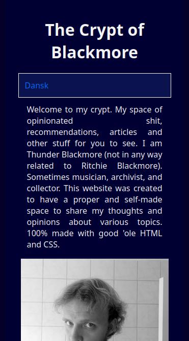
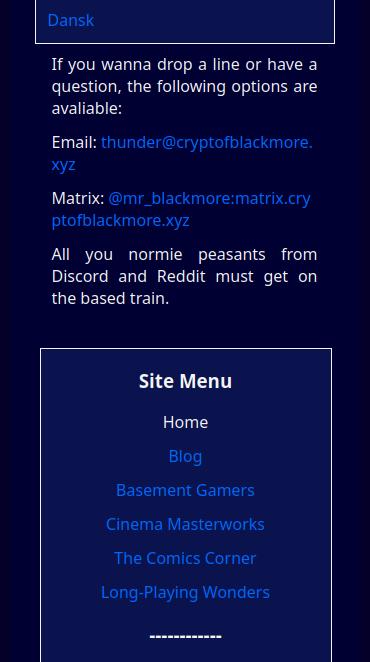
If you recall from my last update, I mentioned that while the site menu and language button was good additions to the site, as a result of me still being quite a newb in CSS, the enhancements didn't translate well to smaller portrait screens (i.e. smartphones) and therefore looked pretty cluttered. Well, I've since learned a bit more about CSS (thanks to my boy Michael, and the ever-so effective tutorials on W3Schools.com), and the knowledge has now manifested itself on mobile.


It looks quite nice, doesn't it?
For the mobile users, I've moved the site menu to the buttom of every page for ease of access. I could maybe have retained it as a sidebar overlap, but I don't know how, and since I want this website to be light, minimalist and fast, I can imagine it putting a damper on the performance. Besides, this is fast enough.
Another thing is the sticky language botton, which is now fixated to the top of the screen even if you keep scrolling down. The intent is to have it simillar to the desktop version, although the bottom being sticky may be removed in the future for redundancy reasons. I don't know, but we'll see to that time.
That's about all. See you and do your best.